- Screencasts
- Learning Objectives
- Framing
- Problem 1: Vertical Alignment
- How It Works
- Problem 2: Make the Footer Stick
- You Do: More Flexbox Properties
- Break
- The Holy Grail Layout
- You Do: hyrule_potion_shop
- Break
- You Do: Airbnb
- Closing / Questions
- Homework
- Resources
- For More Practice
- Give an example of a problem solved by Flexbox.
- Given a desktop-first webpage, make it look presentable on mobile devices (and vice-versa) with as little CSS as possible.
- Contrast flex containers and flex items.
- Explain what is meant by the "Holy Grail Layout".
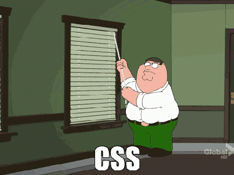
Check out this GIF. Developers used to feel that way all the time defining page layout using CSS. Why is that?
HTML was created as a document-oriented language. CSS emerged as a way to make an HTML file appear more document-like. Literally, like something you would make in Microsoft Word.
So layout wasn't much of a concern in the beginning. But as the web has evolved, so have the design needs of developers. Unfortunately, it takes a while for CSS -- and by that we mean the CSS Working Group -- to catch up with those needs.
It's difficult to establish new CSS standards. The CSS Working Group has a hard time agreeing on anything, especially cross-browser standards.
Fortunately, Flexbox, a layout mode introduced with CSS3, has slowly but surely become a standard over the past few years. It's designed to ensure that elements on a page behave predictively on varying screen sizes and devices.
Let's start out by talking about a problem that anybody who has written CSS has had to deal with:
I have a div. I would like to center it vertically and horizontally on my page. The end result should look something like this...

<body>
  <div>This is my div!</div>
</body>
html {
height: 100%;
}
body {
min-height: 100%;
background-color: #ccc;
margin: 0 auto;
}
div {
width: 100px;
height: 100px;
outline: 1px solid red;
}These might work...
Padding: The simplest approach would be to set equal padding on the top and bottom of the element. We would need to know the exact height of the element and container in order to get this exactly right. This can also get tedious when there is more than one element in a container.
Margin: Similarly, we could add some margin to the element we are trying to center. The same issues remain.
Absolute Positioning: You could use properties like
topandleftto position an element in the center. This, however, removes it from the document flow.
These could work in other scenarios...
line-height: When vertically centering a single line of text, you can set the line-height to that of the whole container.
vertical-align: Used to align words within a line of text (e.g., superscript, subscript).
The tough part is that how to vertically center a element depends on its context. Depending on your situation, one or more of the above techniques could work. Here's an enlightening post on the matter.
html {
  height: 100%;
}

body {
  min-height: 100%;
  background-color: #ccc;
  margin: 0 auto;
  display: flex;
  flex-direction: row;
  justify-content: center;
  align-items: center;
}

div {
  width: 100px;
  height: 100px;
  outline: 1px solid red;
}
When you declare display: flex on a container, it becomes a flex container.
First, you use flex-direction to indicate whether you want the items in the container -- the flex items -- to "read" left-to-right (row), right-to-left (row-reverse), top-to-bottom (column), or bottom-to-top (column-reverse).
When you specify a flex-direction, you can think of it as placing an axis in that direction across your flex container. So if you use flex-direction: row or row-reverse, this main axis will be the same as the X-axis (horizontal) on a graph. Otherwise, it'll be the Y-axis.
Then, you determine how you want to align or justify the items along this main axis using the justify-content property. It'll do nice things for you like let you put even spacing between all the items (space-between and space-around).
Finally, you control how you align the items along the axis that goes across the main axis -- the cross axis, if you will -- with the align-items property. If you have flex-direction:row, the main axis is the X-axis, and the cross-axis is the Y-axis.
Lastly, you can also do nice things like control how you want things to line up across the cross-axis by using align-content, such as space-between and space-around.
| Property | What's It Do? | Examples |
|---|---|---|
| display | flex |
|
| flex-direction | Sets the directional flow of flex items | row, column |
| justify-content | Align along flex-direction (main axis) | center, space-between |
| align-items | Align along not-flex-direction (cross axis) | flex-start, center |
That's a lot of CSS properties! Don't worry, you're not expected to memorize all of them. Us instructors need to look them up all the time! Here's a great resource.
I want my footer to lie along the bottom of my page.
<body>
  <header>This is my header.</header>
  <main><p>Blah blah blah blah blah...</p></main>
  <footer>This is my footer!</footer>
</body>
html {
height: 100%;
}
body {
min-height: 100%;
background-color: #ccc;
margin: 0 auto;
}
footer {
width: 100%;
height: 50px;
background-color: #888;
}Making the footer lie against the bottom of the screen is pretty easy: just use absolute or fixed positioning. However, using absolute or fixed positioning means everything else on the page ignores my footer. The text of <main> could easily run under the footer. We want the text to "push" the footer to the end of the page.
html {
  height: 100%;
}

body {
  min-height: 100%;
  background-color: #ccc;
  margin: 0 auto;
  display: flex;
  flex-direction: column;
  justify-content: space-between;
}

footer {
  width: 100%;
  height: 50px;
  background-color: #888;
}
What's the main axis on here? What about the cross axis?
Main: y-axis. Cross: x-axis.
Time for you to research some more Flexbox properties. You will be split into groups and assigned one of the following flex properties...
align-contentflex-growflex-wraporder
Your task is to...
- Come up with ELI5 ("Explain Like I'm 5") definition for the property.
- List the different values this property can take.
- Create a Codepen demonstrating the property's usage.
- If possible, practice using some of the flex properties we covered in the previous section.
You will need to create a Codepen account in order to save your pen and share the link.
If you finish early, try exploring some of the other flexbox properties not assigned in this exercise.
align-content
How multiple rows or columns are spaced along the cross-axis. Takes the same properties as justify-content.
flex-grow
If the flex container is too big for all the flex bases, the proportion a particular flex item will occupy
flex-wrap
Defines item behavior if they expand beyond a single line.
order
The order in which you want flex items to appear along the main access. The default is 0. Negative numbers are allowed.
flex-basis
How big the flex items "want" to be

This is something you know well, even if you don't recognize the term. It describes a webpage with a header bar, a footer bar, and three columns along the middle: a wide "main" column, a navigation column on the left, and an advertisement, site map, or extra info column along the right.
Obviously, this layout won't work on tiny screens, unless you really like super-skinny columns. It's common to stack things on top of each other for mobile views to make one single column.
Before flexbox, this involved a lot of pushing and shoving with dimensions and positioning. You would essentially have to write two completely separate stylesheets: one for mobile, and one for desktop.
With flexbox, just change the flex-direction for smaller screen sizes, and you're pretty much done!
body {
  display: flex;
  flex-direction: row;
}

@media screen and (max-width: 480px){
  body {
    flex-direction: column;
  }
}
A layout so holy, it has its own Wikipedia article.