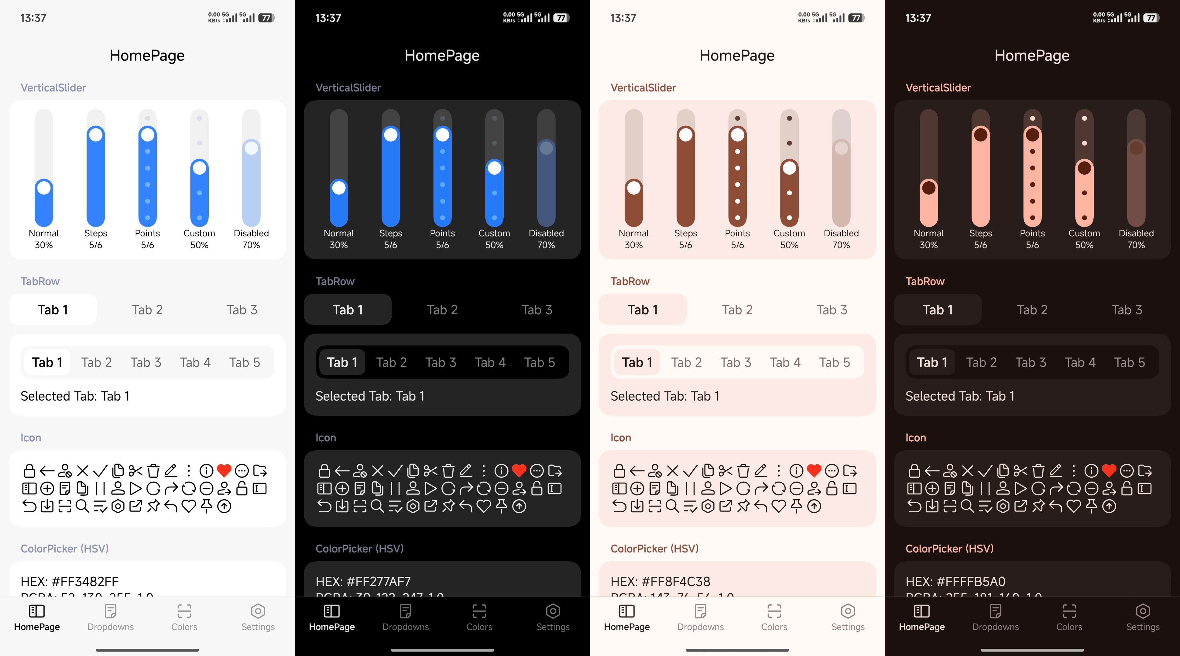
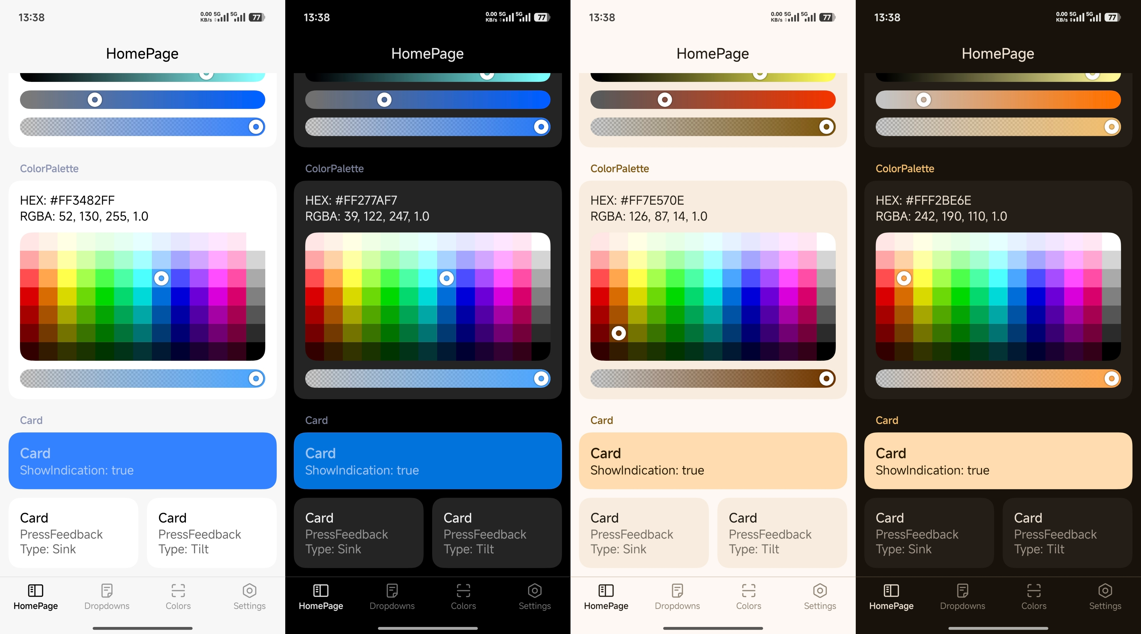
A UI library for Compose Multiplatform.
This library is experimental. APIs may change without notice.


| Module | Description |
|---|---|
miuix-ui |
Core UI component library |
miuix-preference |
Preference components library, depends on miuix-ui |
miuix-icons |
Extended icon library, can be used independently |
miuix-blur |
Blur effect library, can be used independently |
miuix-squircle |
Squircle shapes library, can be used independently |
miuix-navigation3-ui |
Navigation3 UI library, can be used independently |
miuix-shader |
Low-level runtime shader / render effect abstraction |
kotlin {
sourceSets {
commonMain.dependencies {
implementation("top.yukonga.miuix.kmp:miuix-ui:<version>")
// Optional: Add miuix-preference for preference components
implementation("top.yukonga.miuix.kmp:miuix-preference:<version>")
// Optional: Add miuix-icons for more icons
implementation("top.yukonga.miuix.kmp:miuix-icons:<version>")
// Optional: Add miuix-blur for blur effects
implementation("top.yukonga.miuix.kmp:miuix-blur:<version>")
// Optional: Add miuix-squircle for squircle (smooth rounded corner) shapes
implementation("top.yukonga.miuix.kmp:miuix-squircle:<version>")
// Optional: Add miuix-navigation3-ui for navigation3 support
implementation("top.yukonga.miuix.kmp:miuix-navigation3-ui:<version>")
// Other dependencies...
}
// Other sourceSets...
}
// Other configurations...
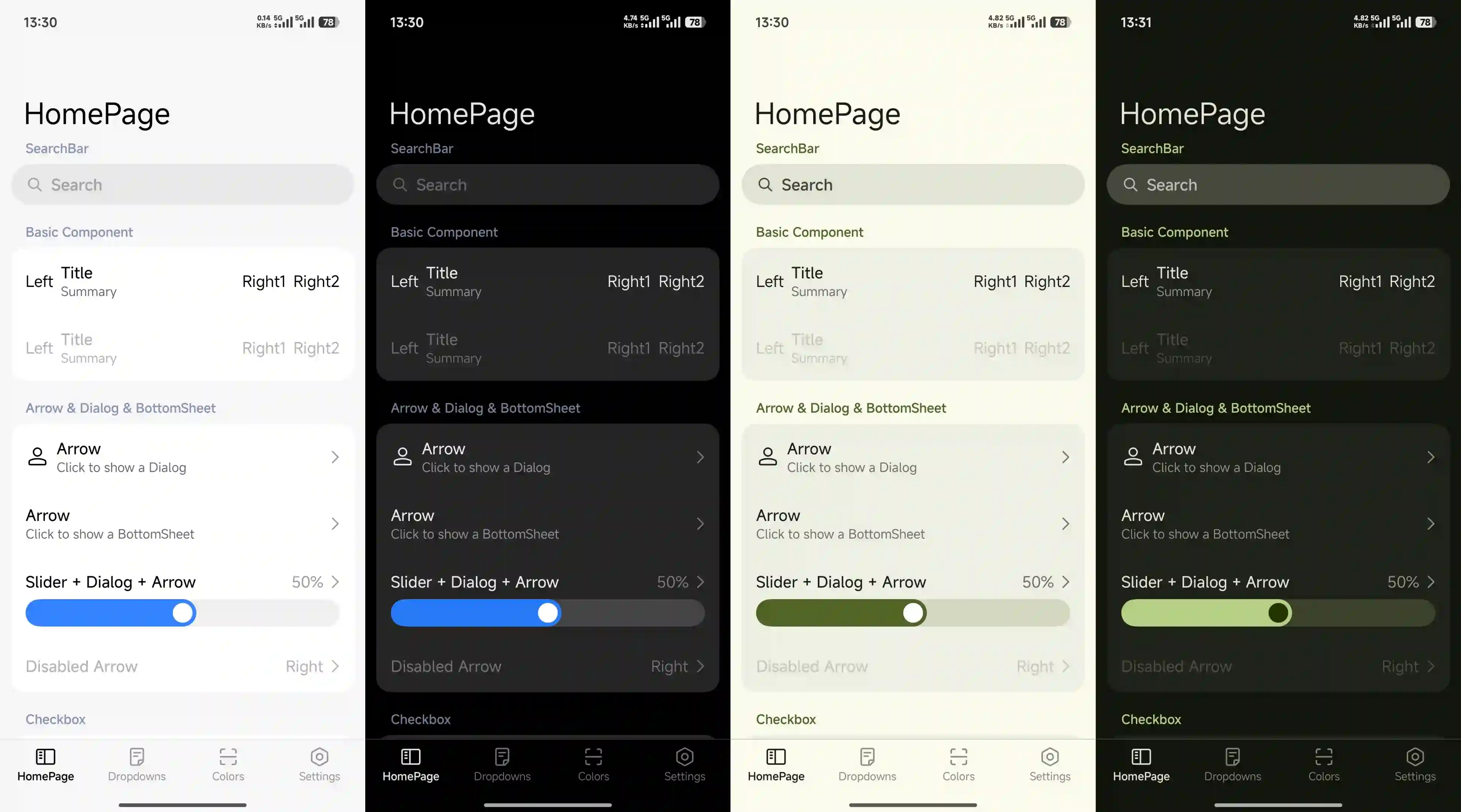
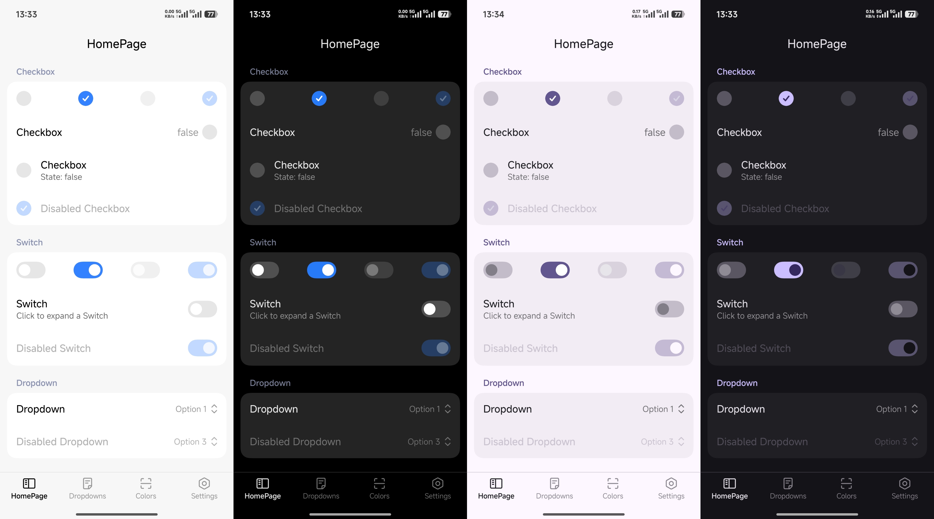
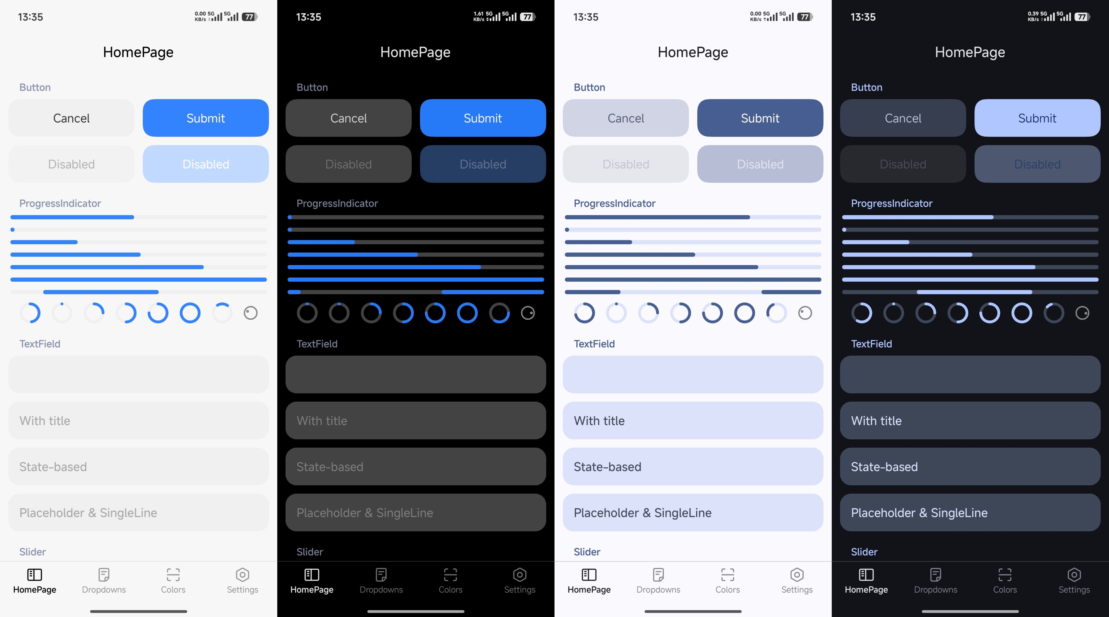
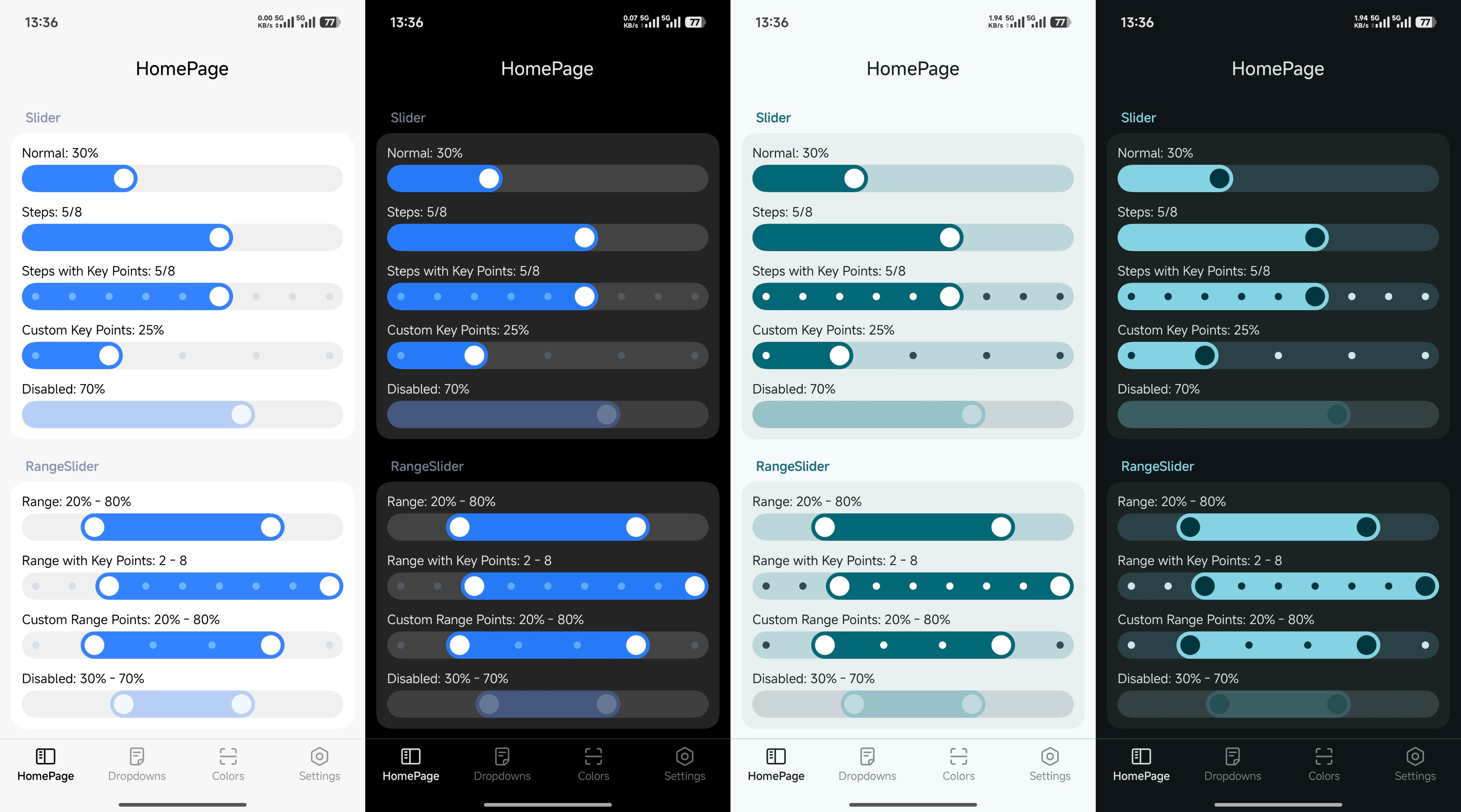
}- Provide a color scheme via
MiuixTheme(colors = ...), e.g.,lightColorScheme()ordarkColorScheme().
@Composable
fun AppTheme(
    content: @Composable () -> Unit
) {
    val colors = if (isSystemInDarkTheme()) darkColorScheme() else lightColorScheme()
    return MiuixTheme(
        colors = colors,
        content = content
    )
}- Use
ThemeControllerto manage modes and enable Monet dynamic colors. PasskeyColorto set a custom seed color.
@Composable
fun AppTheme(
    content: @Composable () -> Unit
) {
    val controller = remember {
        ThemeController(
            ColorSchemeMode.MonetSystem,
            keyColor = Color(0xFF3482FF)
        )
    }
    return MiuixTheme(
        controller = controller,
        content = content
    )
} |
 |
 |
 |
 |
 |