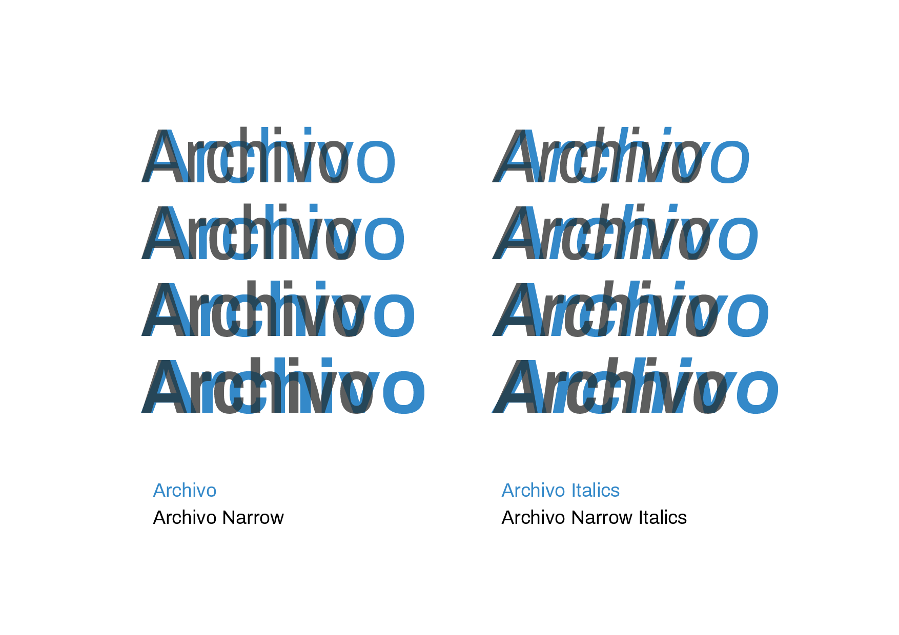
The vertical metrics of these 2 families should be identical,
https://fonts.google.com/specimen/Archivo
https://fonts.google.com/specimen/Archivo+Narrow
But they aren't. This suggests to me that there is a class of font bakery checks missing for 'super families' to keep them consistent. We now have quite a few super families, typically with different widths, but also different optical sizes (eg "Something Sans" and "Something Sans Display" or "Something Sans Micro")
Should be
The vertical metrics of these 2 families should be identical,
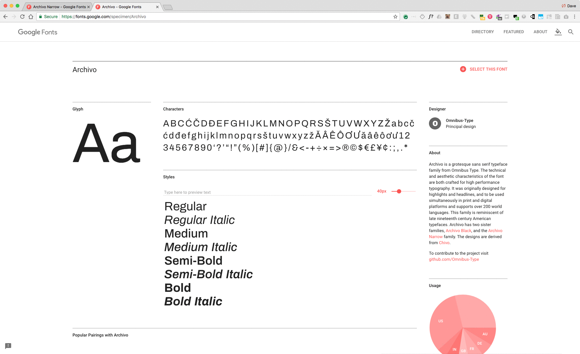
https://fonts.google.com/specimen/Archivo
https://fonts.google.com/specimen/Archivo+Narrow
But they aren't. This suggests to me that there is a class of font bakery checks missing for 'super families' to keep them consistent. We now have quite a few super families, typically with different widths, but also different optical sizes (eg "Something Sans" and "Something Sans Display" or "Something Sans Micro")
Should be