Conversation
|
Niceee very cool @aliabid94! |
|
All the demos for this PR have been deployed at https://huggingface.co/spaces/gradio-pr-deploys/pr-2208-all-demos |
| """ | ||
| Parameters: | ||
| label: name of accordion section. | ||
| open: An optional string that is assigned as the id of this component in the HTML DOM. Can be used for targeting CSS styles. |
There was a problem hiding this comment.
open is a Python keyword so syntax highlighters annoyingly highlight it. WDYT about naming this closed instead?
|
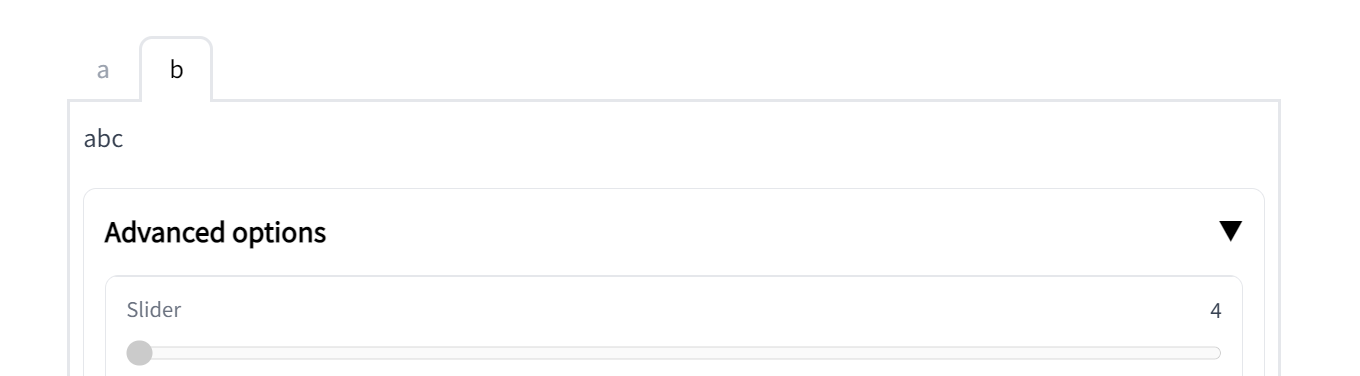
Would it be possible to support gr.Interface(
image_generator,
[gr.Textbox(),
gr.Accordion("Advanced Options", [
gr.Slider(),
gr.Slider(),
]
]
gr.Image()
]Otherwise, LGTM @aliabid94! |
|
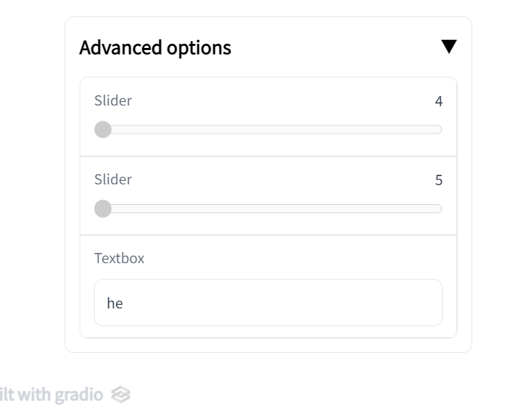
One other thing: the label of the Accordion is much bigger, darker, and bolder than the label of the other components as you can see here:
I think it stands out too much. What about making it the same font style as the title of tabs:
|
|
ok made the label smaller and not bold. Also added mention to guides. Adding to Interface will be a lot of work, let's make a separate issue for that. Let's get this in for 3.3 @abidlabs |
| See how the first column has two Textboxes arranged vertically. The second column has an Image and Button arranged vertically. Notice how the relative widths of the two columns is set by the `scale` parameter. The column with twice the `scale` value takes up twice the width. | ||
|
|
||
| ## Tabs | ||
| ## Tabs amd Accordions |
There was a problem hiding this comment.
| ## Tabs amd Accordions | |
| ## Tabs and Accordions |
| $code_blocks_flipper | ||
| $demo_blocks_flipper | ||
|
|
||
| Also note the Accordion that can be opened and closed - another layout element to selectively show content. |
There was a problem hiding this comment.
| Also note the Accordion that can be opened and closed - another layout element to selectively show content. | |
| Also note the `gradio.Accordion('label')` in this example. The Accordion is a layout that can be toggled open or closed. Like `Tabs`, it is a layout element that can selectively hide or show content. Any components that are defined inside of a `with gradio.Accordion('label'):` will be hidden or shown when the accordion's toggle icon is clicked. |
|
Ok sounds good! LGTM |
|
oh whoops merged before reading comments, will make another pr for them |
|
I missed this PR but I don't understand why this component was added instead of just adding some options to |
|
Agree with communicating on this more, but from my understanding |
|
I may have meant There are also some issues with the implementation, I'll take a look at them when I get time. |
|
Oh sorry yeah. Makes sense to incorporate into |
3 participants
Allows users to wrap elements in an accordion. It's been requested several times and I thought this might be useful for the more complex SD demos being created right now.
Fixes: #938
Use: