Reworking layout styling#2291
Conversation
|
All the demos for this PR have been deployed at https://huggingface.co/spaces/gradio-pr-deploys/pr-2291-all-demos |
|
With this change, is there anything that is currently possible but would not be possible if we remove Box and Group? I think the changes look good, just not sure if deprecating Box and Group will cause issues. |
|
So I removed the ability to set margins, rounding and borders because I don't think it made sense - these should be automatically be rendered based on the adjacent components, not on a per-component basis. We'll have to discuss what exactly we want users to be be able to control per-component, and what they can control via theming. See |
There was a problem hiding this comment.
This looks goo to me and I agree about settings margins, borders and border-radiuses, that no longer makes sense since it is handled by the layout system. I think should be settable on a global level but not sure what makes sense on a per component basis. I think probably none of them (expect perhaps borders themselves).
Only thing to be aware of is that this is a pretty significant breaking change: people using sone the old style args will no longer have the same layout and it will look bad in weird ways. And people using layout defaults will have apps that look different. I think in most cases this will be an improvement and there shouldn't be too many negative effects (as I think usage of style props was low), so I think this is okay given the improvements it brings. We just need to be aware of it from a support PoV.
|
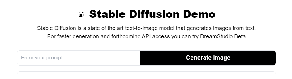
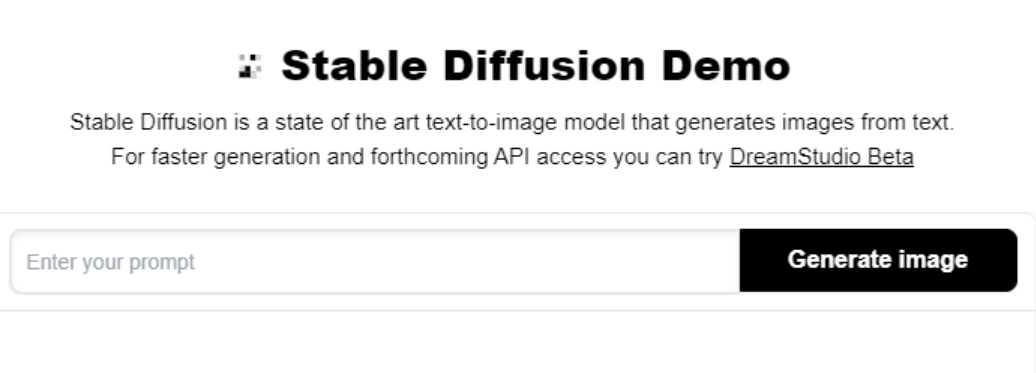
I released a beta version ( However, when I was recreating the Stable Diffusion Space, I noticed the button and textbox take equal width when inside a
Previously (in
Is there a way to get this UI with these new layout changes? Here's my code: https://colab.research.google.com/drive/1vg4aV2_x3kf6uOitslc6Vsi2kqxeI7vV?usp=sharing In particular, when testing for backwards compatibility, can we make sure that the web uis for Stable Diffusion do not break since many people have cloned those and are running on colab, which means they will automatically use the latest version? (In fact, we should mock up a couple of the popular SD web UIs and add them to the Spaces previewer to be 100% sure) |
|
you have to set
|
|
Btw @aliabid94 does this close #2152? If so, we should add that to the PR description |
|
Awesome @aliabid94! Tested a bunch of demos and they all LGTM |
3 participants
This is a proposal on reworking how adjacent components can be styled to be "grouped" together, such that there is no gap between them and only the components at the ends of the group are rounded to create the visual effect of being a single group. This is currently done as such:
gr.Boxto create the rounded style,gr.Groupinside to remove spacing between elements.This is quite complicated, and not very mobile friendly. For example, imagine two components A and B placed horizontally. We may remove the right margin of A and round the left border of A (and the inverse for B). But if the screen shrinks such that A and B must be placed vertically, all margins and rounding will be incorrect.
A more effective version of this logic is already done with the
gr.Formcomponent (which automatically wraps all adjacent "form" components).gr.Formremoves the gap between all adjacent components and provides a rounded border to combine them all.What I propose is similar CSS styling logic used in a new variant for
gr.Row()andgr.Column(). Agr.Row(variant="group")orgr.Column(variant="group")will automatically combine all child components into a single "group", removing gaps and setting borders as necessary.BEFORE:
AFTER:
Along with this change, I would like to deprecate:
gr.Groupgr.BoxI believe this new variant proposal is in the spirit of "the user should not be able to create a bad looking demo with our style API".