


A modern and interactive custom card to display your entities as linear gauges. Enjoy a premium design, smooth animations, and high display flexibility.
- Visual Editor: Fully configurable via the Home Assistant UI.
- Theme Integration: Follows your Home Assistant theme or custom background color with transparency support.
- Interactive Actions: Full support for
tap_actionon each entity (toggle, navigation, call-service, URL). - Target Entity: Actions can target a different entity than the one displayed.
- Icons: Material Design icons support.
- Targets: Display a target marker (fixed value or entity).
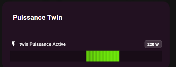
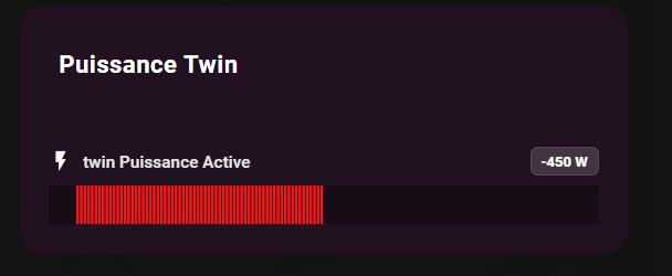
- Visual Alerts: Pulse animation for critical states.
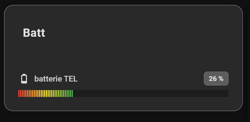
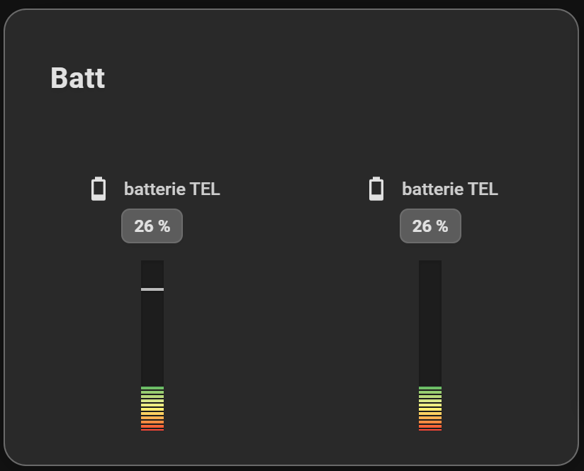
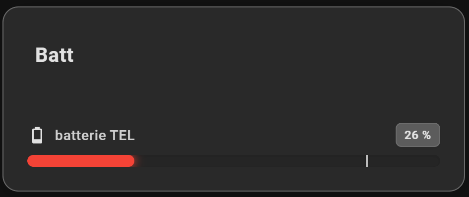
- 24h Min/Max: Visualization of the value range over the last 24 hours.
- Flexible Layout: Choose between horizontal (list) or vertical (columns) display.
- Smart Gradients: Define a global gradient or specific colors per entity.
- LED Effect: Segmented and rectangular display mode for a modern "pixel" style.
- Compact Mode: Minimal display with just icon and bar to save space.
- Value in Bar: Display the value directly on the progress bar (hides the value next to the name to avoid duplication).
- Shimmer Effect: Animated shine effect on bars (can be disabled).

- Open HACS in Home Assistant
- Go to "Frontend"
- Click on the menu (⋮) in the top right
- Select "Custom repositories"
- Add the URL:
https://github.com/guiohm79/jaugeLineaire - Select category "Lovelace"
- Click "Install"
- Restart Home Assistant
- Download the
linear-gauge-card.jsfile - Copy it to
config/www/linear-gauge-card.js - Add the resource in Home Assistant:
- Go to Settings → Dashboards → Resources
- Click + Add Resource
- URL:
/local/linear-gauge-card.js - Type: JavaScript Module
- Restart Home Assistant
The card can be configured entirely via the Visual Editor.
Type: custom:linear-gauge-card
| Option | Type | Description |
|---|---|---|
title |
string | Card title |
entities |
list | List of entities to display (required) |
layout |
string | horizontal (default) or vertical |
min |
number | Global minimum value (default: 0) |
max |
number | Global maximum value (default: 100) |
show_min_max |
boolean | Show 24h min/max markers (default: false) |
colors |
list | List of colors for a global gradient |
color |
string | Global fixed color (overrides gradient) |
color_negative |
string | Global fixed color for negative values when center_zero is active |
severity |
list | Global severity configuration |
effect |
string | default or led for a rectangular segmented effect |
tap_action |
object | Default action on click (e.g., toggle) |
transparent |
boolean | Transparent background (default: false) |
card_background |
string | Custom card background color (with alpha support) |
compact_mode |
boolean | Compact display mode (default: false) |
show_value_in_bar |
boolean | Show value inside the bar, hides value next to name (default: false) |
disable_shimmer |
boolean | Disable the shimmer animation effect (default: false) |
center_zero |
boolean | Start the bar at the zero point. Negative values extend left/bottom, positive extend right/top (default: false) |
bar_thickness |
number | Bar thickness in pixels (default: 12) |
vertical_height |
number | Vertical bar height in pixels (default: 120) |
vertical_width |
number | Vertical bar width in pixels (default: 16) |
Each entity in the list can be configured individually:
| Option | Type | Description |
|---|---|---|
entity |
string | Entity ID (e.g., sensor.cpu_load) |
name |
string | Custom displayed name |
icon |
string | Icon (e.g., mdi:thermometer) |
target |
number/string | Target value or target entity ID |
min / max |
number | Specific limits for this entity |
color |
string | Fixed color for this gauge (overrides global) |
color_negative |
string | Fixed color for negative values when center_zero is active |
severity |
list | Specific color thresholds |
effect |
string | Effect override (default or led) |
pulse |
object | Pulse alert configuration (see below) |
tap_action |
object | Specific action on click |
compact_mode |
boolean | Compact mode for this entity |
show_value_in_bar |
boolean | Show value in bar for this entity |
disable_shimmer |
boolean | Disable shimmer for this entity |
center_zero |
boolean | Center zero mode for this entity |
Define color thresholds based on value ranges:
severity:
  - from: 0
    color: "#4caf50"    # Green
  - from: 50
    color: "#ffeb3b"    # Yellow
  - from: 80
    color: "#f44336"    # Red
pulse: true # Enable pulse animationAllows triggering an animation if a value exceeds a threshold:
pulse:
  value: 80           # Threshold value
  condition: above    # 'above' (>=) or 'below' (<=)
Pulse can also be activated via severity with pulse: true.
Standard Home Assistant configuration:
tap_action:
  action: toggle              # or more-info, call-service, navigate, url, none
  target_entity: light.bureau # Optional: Action targets this entity instead
  # for navigate:
  navigation_path: /lovelace/0
  # for url:
  url_path: https://example.com
  # for call-service:
  service: light.turn_on
  data:
brightness: 255type: custom:linear-gauge-card
title: Server
show_min_max: true
colors:
- "#4caf50"
- "#ffeb3b"
- "#f44336"
entities:
- entity: sensor.cpu_load
name: CPU
icon: mdi:cpu-64-bit
target: 80 # Marker at 80%
severity:
- from: 90
color: "#d32f2f"
pulse: true # Activates pulse animation
- entity: sensor.temperature
icon: mdi:thermometer
target: sensor.target_temp # Dynamic marker
tap_action:
action: toggle
target_entity: switch.fan_coolertype: custom:linear-gauge-card
title: Battery
effect: led
entities:
- entity: sensor.battery_level
name: Leveltype: custom:linear-gauge-card
title: Resources
layout: vertical
entities:
- entity: sensor.cpu_load
name: CPU
- entity: sensor.memory_usage
name: RAM
- entity: sensor.disk_use_percent
name: Disktype: custom:linear-gauge-card
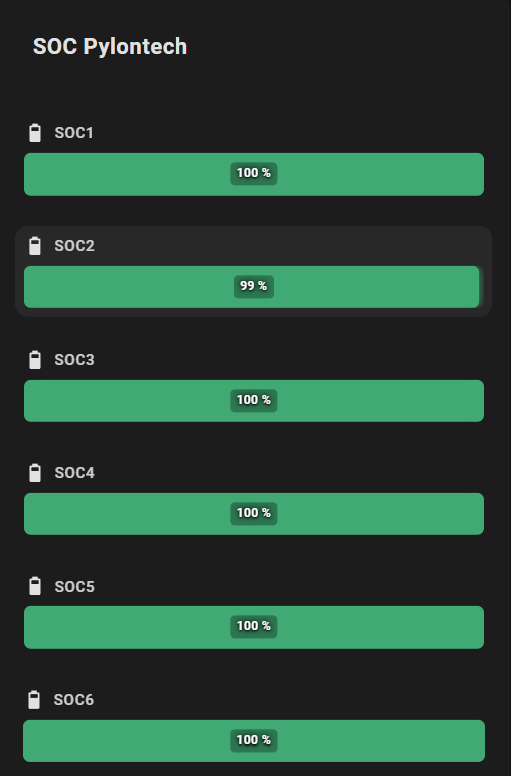
title: Battery Levels
compact_mode: true
show_value_in_bar: true
colors:
- "#f44336"
- "#ffeb3b"
- "#4caf50"
entities:
- entity: sensor.battery_1
icon: mdi:battery
- entity: sensor.battery_2
icon: mdi:battery
- entity: sensor.battery_3
icon: mdi:battery
compact_mode: false # Override: show full for this entitytype: custom:linear-gauge-card
title: Clean Look
disable_shimmer: true # Disable shimmer globally
entities:
- entity: sensor.cpu_load
name: CPU
icon: mdi:cpu-64-bit
- entity: sensor.memory_usage
name: RAM
icon: mdi:memory
disable_shimmer: false # Re-enable for this entitytype: custom:linear-gauge-card
title: Temperature
card_background: "rgba(255, 0, 0, 0.2)" # Semi-transparent red
entities:
- entity: sensor.living_room_temp
icon: mdi:thermometertype: custom:linear-gauge-card
title: Energy Monitor
color: "#03a9f4" # Global fixed blue color
entities:
- entity: sensor.solar_power
name: Solar
icon: mdi:solar-power
max: 5000
color: "#ffeb3b" # Yellow for solar
- entity: sensor.house_power
name: House
icon: mdi:home-lightning-bolt
max: 5000
- entity: sensor.grid_power
name: Grid
icon: mdi:transmission-tower
max: 5000
severity:
- from: 0
color: "#4caf50" # Green when consuming
- from: 1000
color: "#f44336" # Red when high consumptionWhen multiple color options are defined, the following priority order is used:
- Entity severity (highest priority)
- Entity fixed color (
color) - Global severity (
severity) - Global fixed color (
color) - Global gradient (
colors) - Default theme color (fallback)
If you encounter any issues or have feature requests, please open an issue on GitHub.
If you find this card useful, consider buying me a coffee! ☕