In many contexts a dropdown is not the best choice. If the default choice list is very short, buttons would be better in my opinion. As an example: direction of a yield sign.
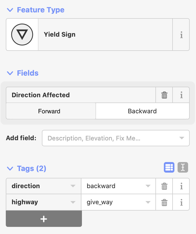
A direction can be chosen with just one click and reversed also with one click.
In many contexts a dropdown is not the best choice. If the default choice list is very short, buttons would be better in my opinion. As an example: direction of a yield sign.
A direction can be chosen with just one click and reversed also with one click.