This is a list of concerns we found when auditing TalkBack support in Gutenberg. The audit was done using develop (c9578a0), Google Pixel 4 XL, Android 10.
Concerns
Block Content Descriptions
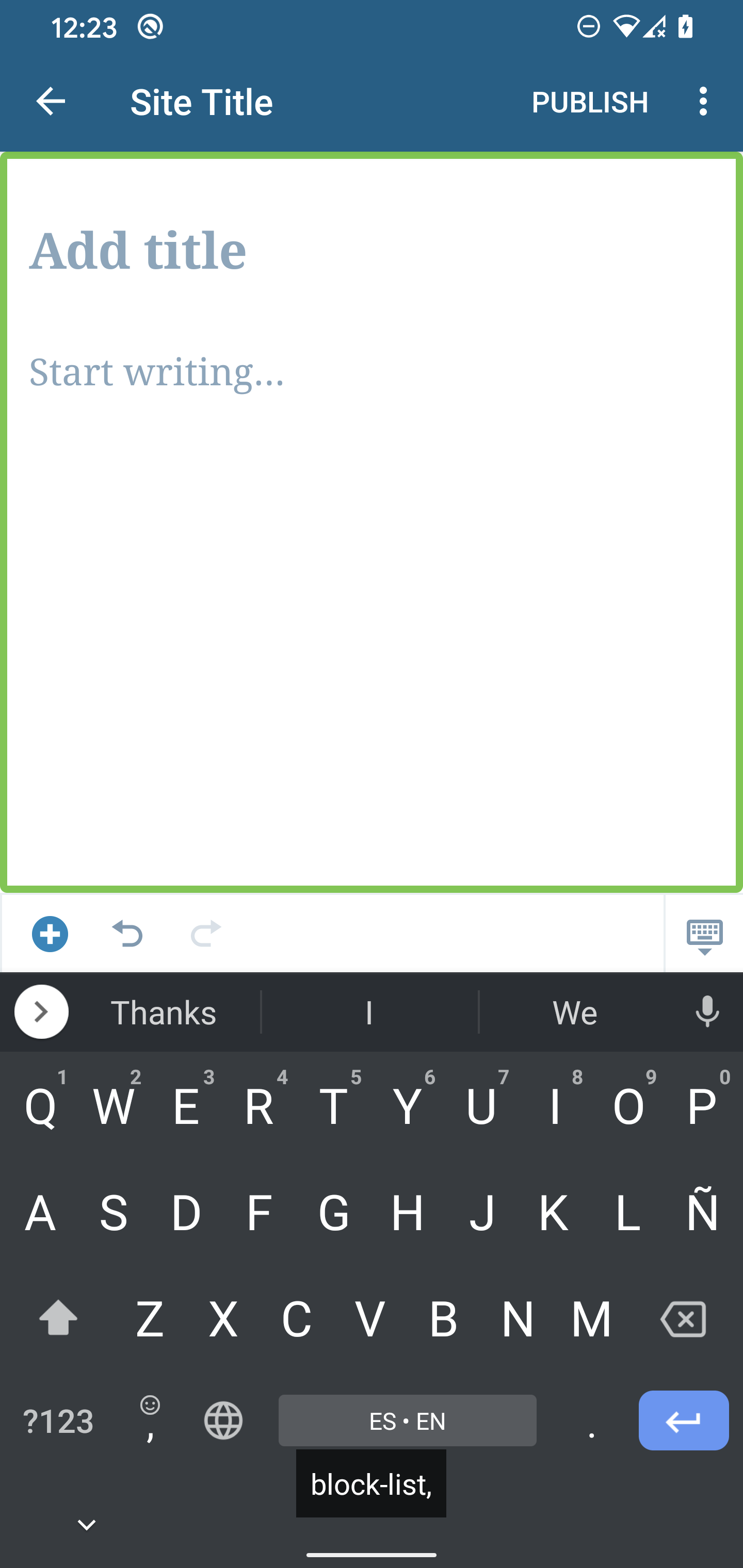
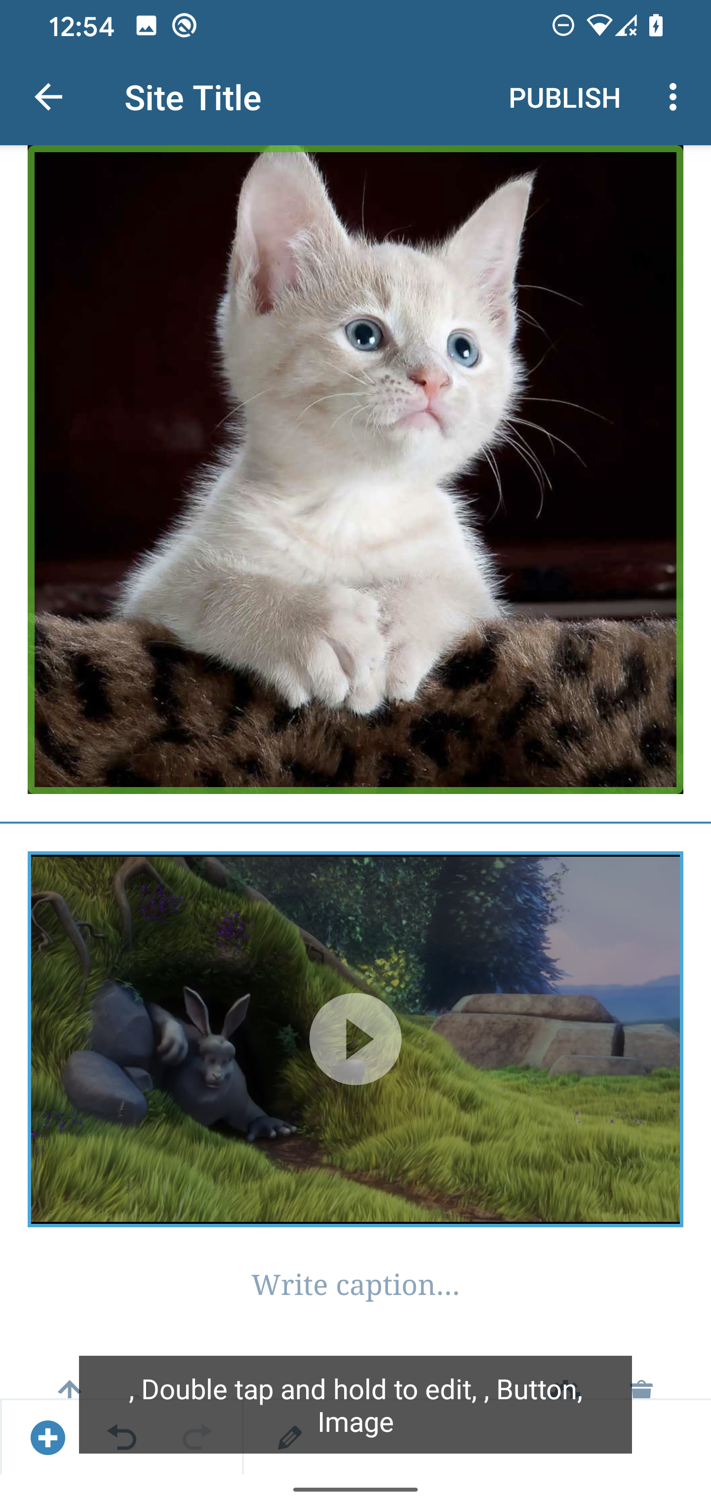
All content descriptions seem to contain an unneeded comma.
Block Options
Some options announce the row of the block and others, for example, Settings don't do that. We should consider adding the Block type to these so that the user knows which block they are in. It's not totally necessary though, because if they were to switch to another block then it would be announced, nonetheless, it would be a good improvement.
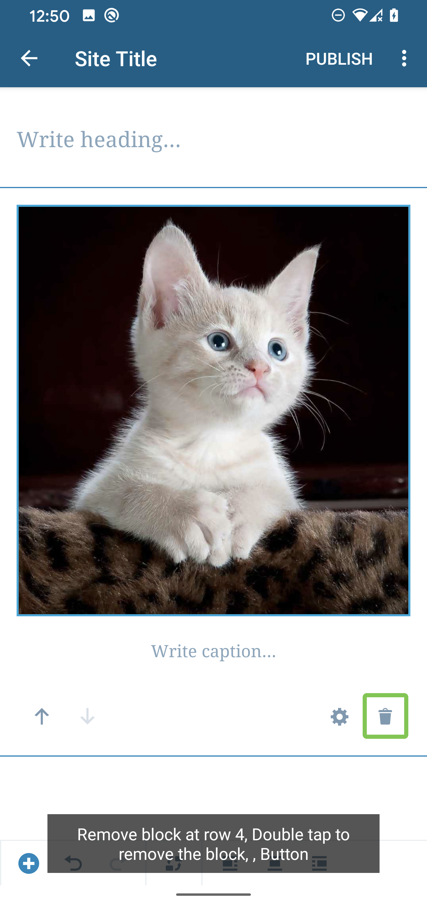
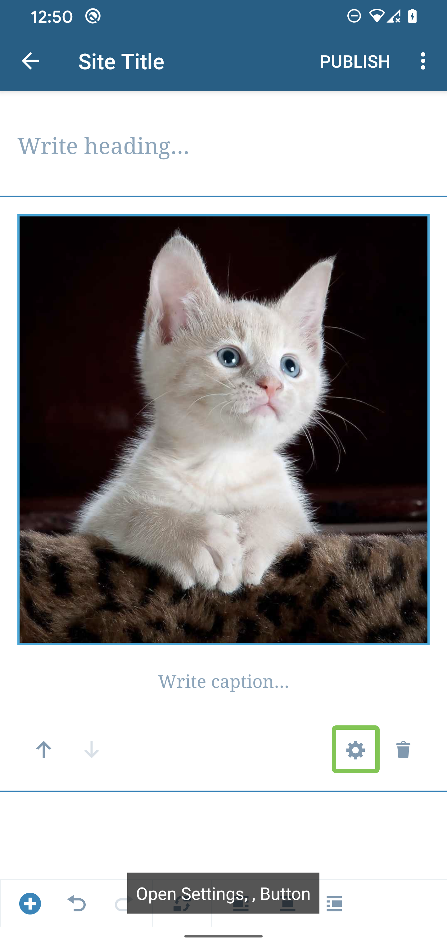
| Block Removal |
Block Settings |
 |
 |
Video Block
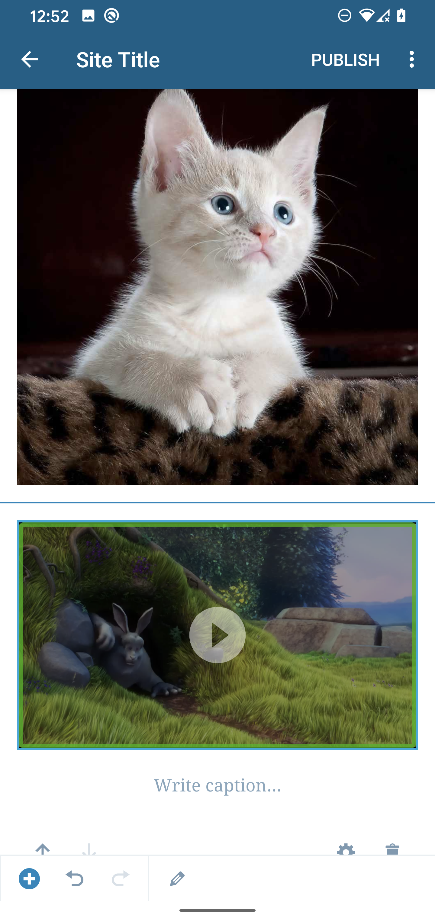
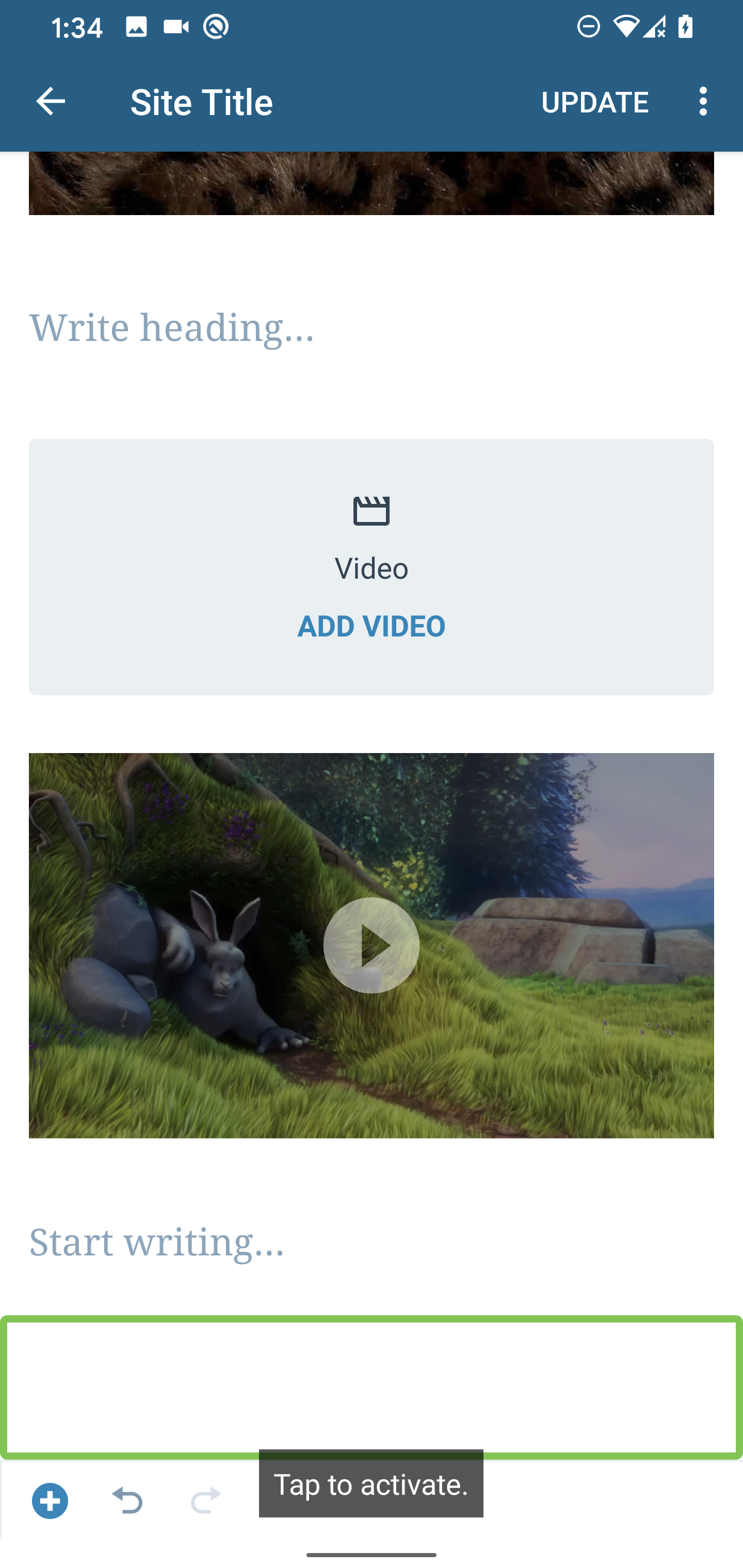
When a video is added the video can be focused/selected but it doesn't state an action that can be performed. In contrast, selecting an image announces it's actions.
| Video |
Image |
 |
 |
Select Blocks Process
Improving the select block process would be beneficial as I didn't know I had to double-tap to make a block selected until I did some experiments. Also, there are several blocks that can't be selected especially text-based blocks that get focused.
Unlabeled element
There's an unlabeled element at the end of the list that becomes activated, similarly to iOS this can be disabled since an "Add Block" button already exists for the user.
Repetitive Button Hints
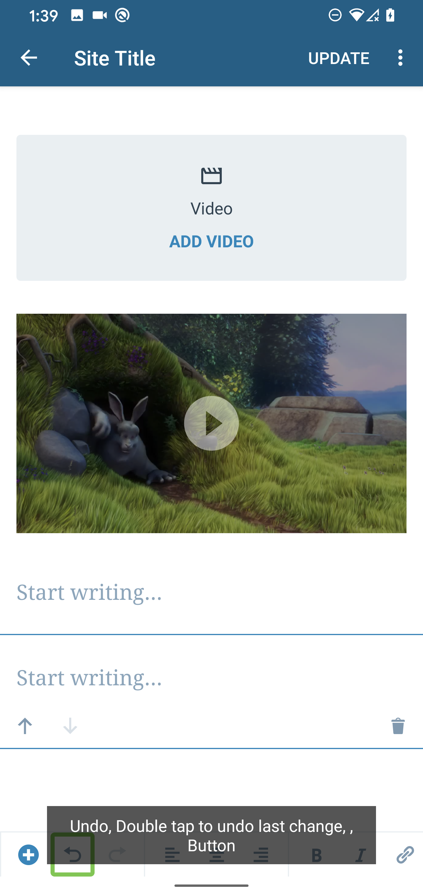
Similarly to iOS, The actions that the button performs don't have to be added to the hint since the Accessibility framework takes care of this as seen in the screenshots below. It could even be confusing to the user because the hint is telling them to "double-tap" while TalkBack is saying "tap to activate". Note: This seems to happen for several other controls as well.
| Button Hint |
Button Action |
 |
 |
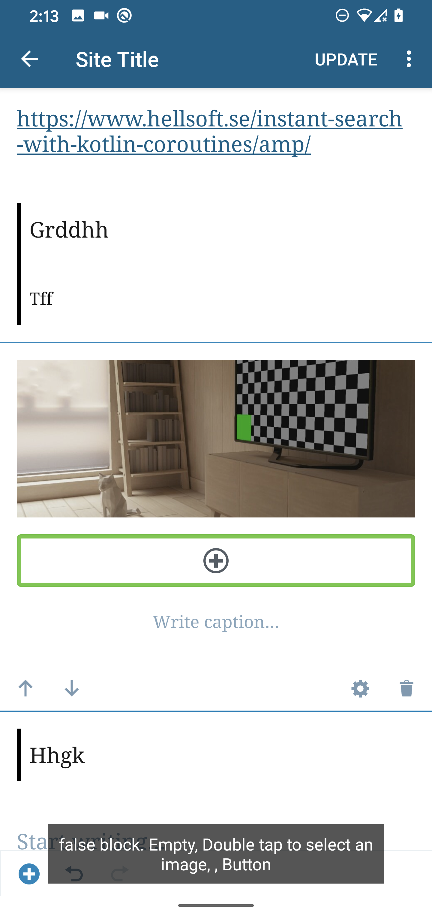
Gallery - Add Image Hint
When you select the Add button that allows you to add another image to the gallery it's announced as "false block". It would be better if this is announced as "Add another image,Button"
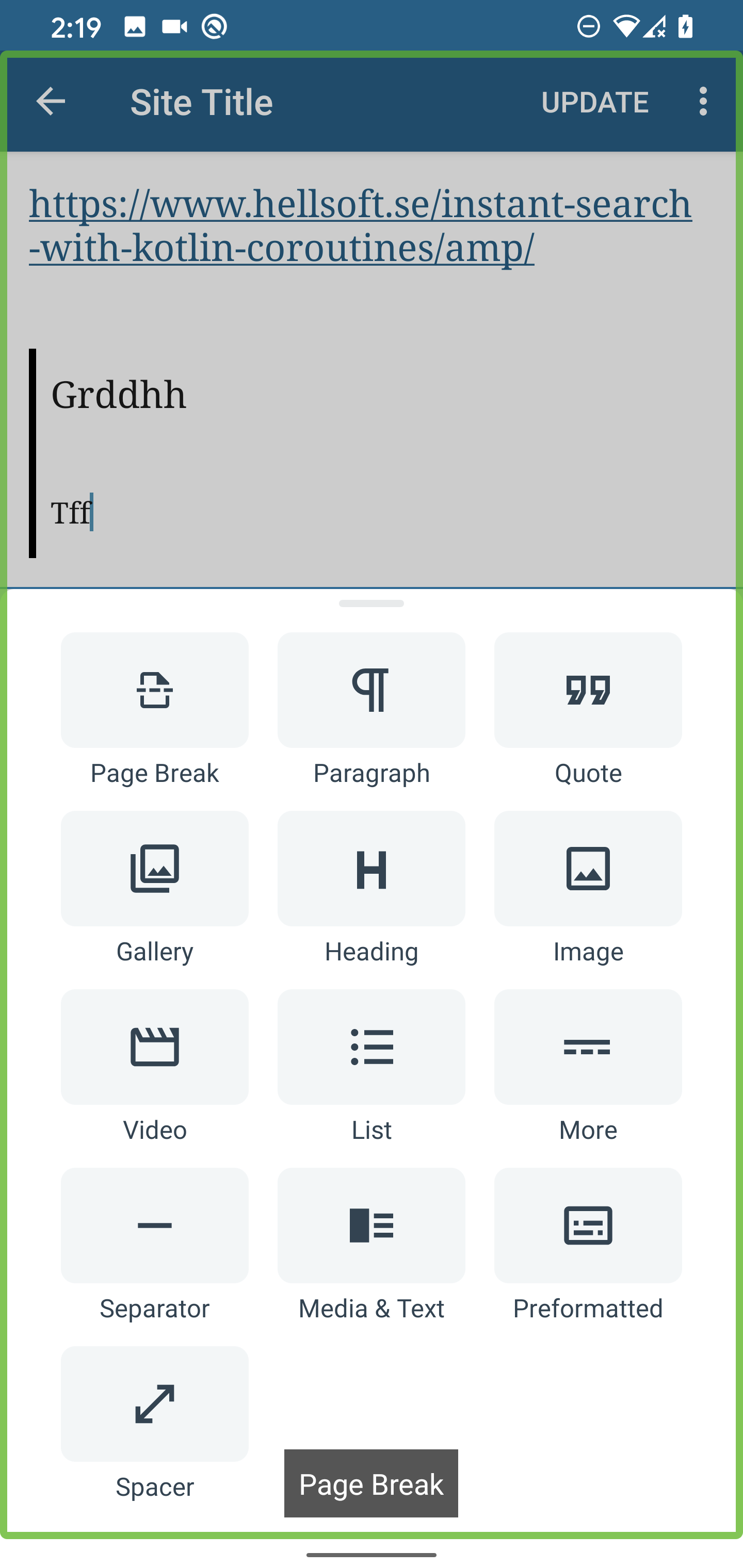
Add Block Popup Menu
When the menu is opened "Page Break" is announced as the first item but the focus is still on the entire screen. Sometimes other items are selected/focused and "Page Break" is still being announced.
Unable to Select Selector
When I try to select the selector it doesn't get focused.
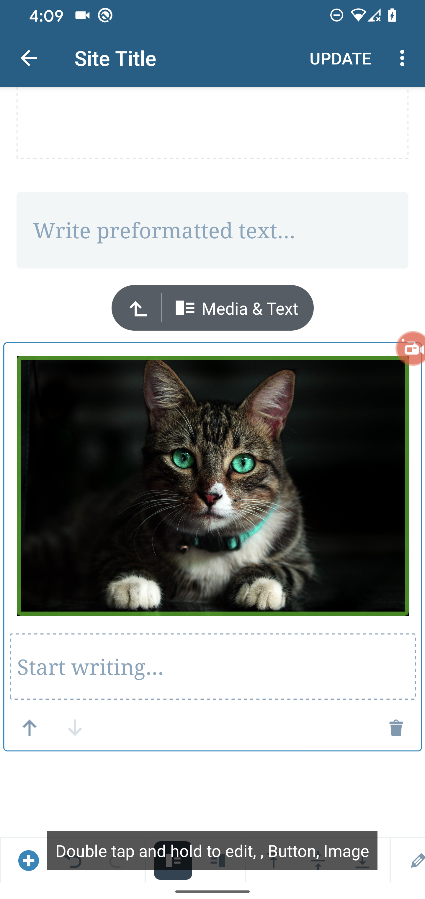
Media & Text
Media & Text is focused and says tap to activate but it does nothing.
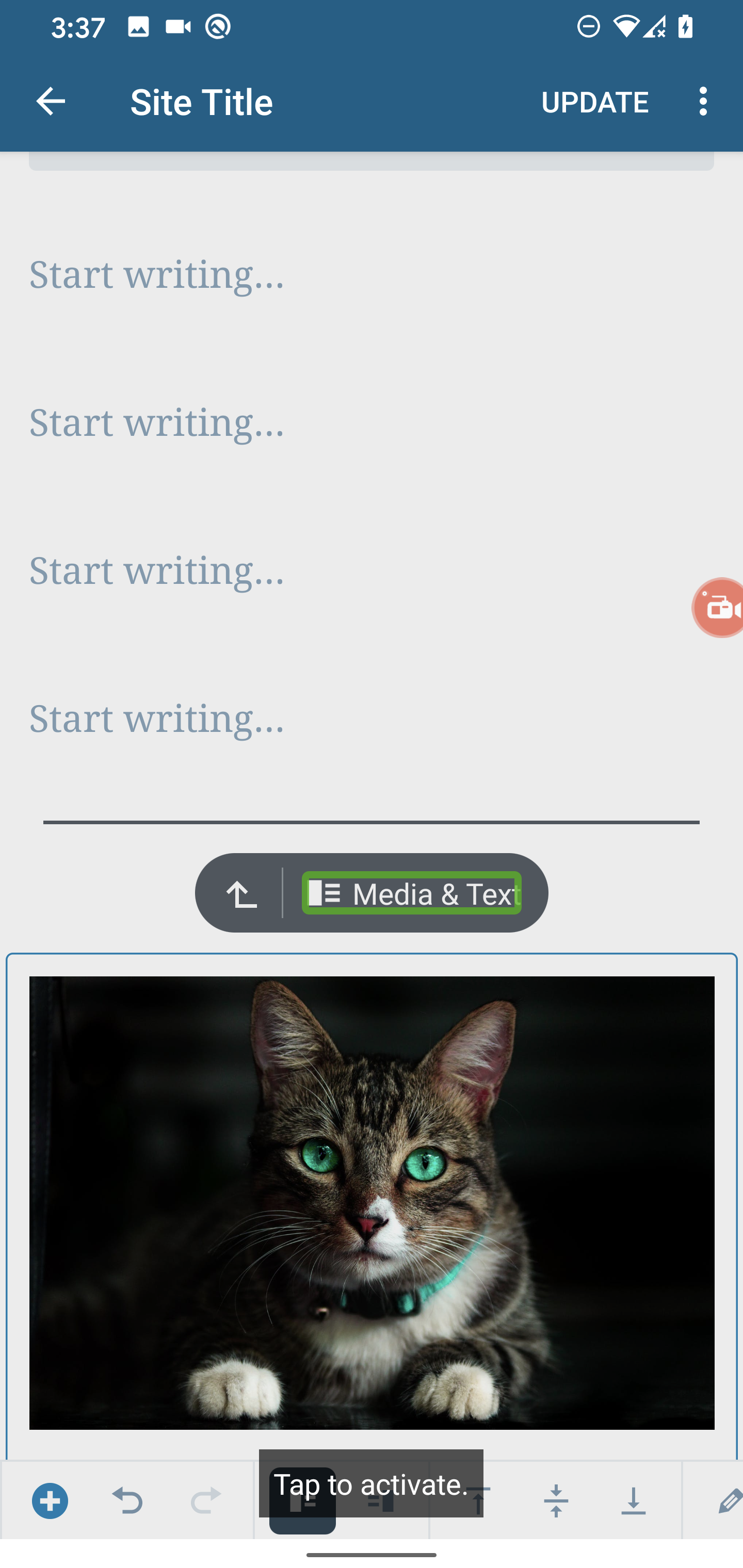
The image announces that it can be edited but tapping it does nothing. Also the content description i.e the hint & view types are a bit confusing.
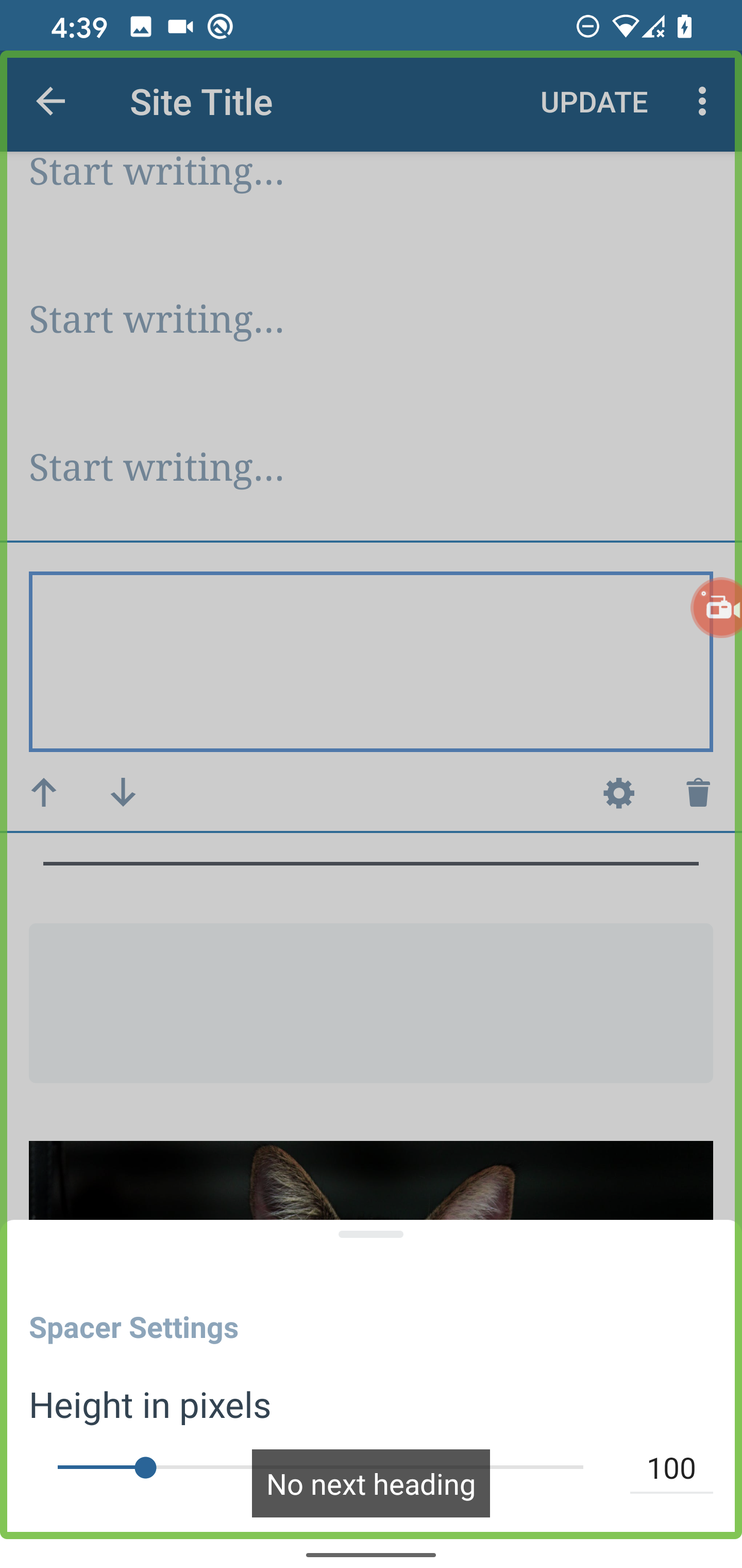
Spacer - Settings
When I try to select the Spacer Settings header it tries to focus on the whole view.
Also when "heading" navigation is enabled the "Spacer Settings" header is ignored. This behavior is also present in Image Settings as well. Headers are created by using the accessibilityHeading attribute.
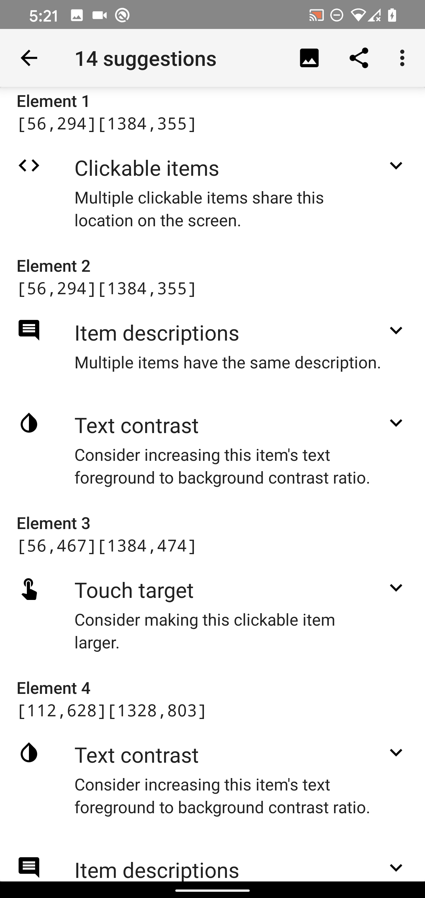
Accessibility Scanner Audit
An accessibility scanner audit was done to get an idea of issues that exists within the editor.
| List Navigation |
Visual Navigation |
 |
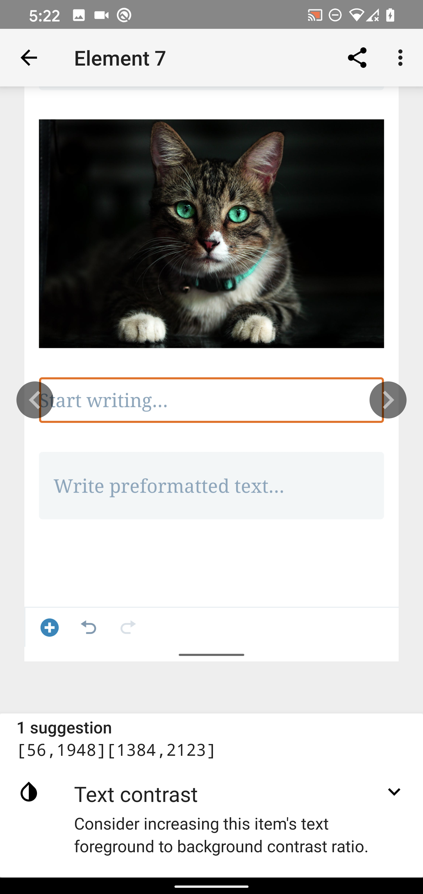 |
Most notably, there were issues with components not meeting touch target recommendations, text contrast & missing labels. Based on my experience with the results of this scan there will be some issues that can be ignored due to design & usability reasons but for others can be addressed
- Touch Targets -
TouchDelegate for views that need more space without UI modification. Padding if the UI can be done.
- Contrasts - The WordPress color palette within our apps contains variations of each color use so you can find a darker color to meet the requirement while still adhering to the design. Contrast Checker is a good tool to verify this.
- Missing labels - some components might not need labels if they aren't supposed to be accessible so they can be marked as not important for accessibility using that property on the target view.
This is a list of concerns we found when auditing TalkBack support in Gutenberg. The audit was done using develop (c9578a0), Google Pixel 4 XL, Android 10.
Concerns
Block Content Descriptions
All content descriptions seem to contain an unneeded comma.
Block Options
Some options announce the row of the block and others, for example, Settings don't do that. We should consider adding the Block type to these so that the user knows which block they are in. It's not totally necessary though, because if they were to switch to another block then it would be announced, nonetheless, it would be a good improvement.
Video Block
When a video is added the video can be focused/selected but it doesn't state an action that can be performed. In contrast, selecting an image announces it's actions.
Select Blocks Process
Improving the select block process would be beneficial as I didn't know I had to double-tap to make a block selected until I did some experiments. Also, there are several blocks that can't be selected especially text-based blocks that get focused.
Unlabeled element
There's an unlabeled element at the end of the list that becomes activated, similarly to iOS this can be disabled since an "Add Block" button already exists for the user.
Repetitive Button Hints
Similarly to iOS, The actions that the button performs don't have to be added to the hint since the Accessibility framework takes care of this as seen in the screenshots below. It could even be confusing to the user because the hint is telling them to "double-tap" while TalkBack is saying "tap to activate". Note: This seems to happen for several other controls as well.
Gallery - Add Image Hint
When you select the Add button that allows you to add another image to the gallery it's announced as "false block". It would be better if this is announced as "Add another image,Button"
Add Block Popup Menu
When the menu is opened "Page Break" is announced as the first item but the focus is still on the entire screen. Sometimes other items are selected/focused and "Page Break" is still being announced.
Unable to Select Selector
When I try to select the selector it doesn't get focused.
Media & Text
Media & Text is focused and says tap to activate but it does nothing.
The image announces that it can be edited but tapping it does nothing. Also the content description i.e the hint & view types are a bit confusing.
Spacer - Settings
When I try to select the Spacer Settings header it tries to focus on the whole view.
Also when "heading" navigation is enabled the "Spacer Settings" header is ignored. This behavior is also present in Image Settings as well. Headers are created by using the
accessibilityHeadingattribute.Accessibility Scanner Audit
An accessibility scanner audit was done to get an idea of issues that exists within the editor.
Most notably, there were issues with components not meeting touch target recommendations, text contrast & missing labels. Based on my experience with the results of this scan there will be some issues that can be ignored due to design & usability reasons but for others can be addressed
TouchDelegatefor views that need more space without UI modification. Padding if the UI can be done.